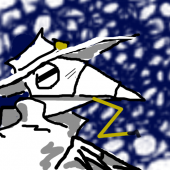
AyGee Posted September 27, 2015 Share Posted September 27, 2015 I tried to gather some opinions over on the Weasyl forums, but no one has posted ANYTHING in the critique section in the three days since. So I'm gonna ctrl-c/ctrl-v the topic here, since I know this crowd to be a little more vocal.I don't have much to show off at the moment, and maybe I'm still trying to find a niche, but I'm feeling a little concerned that I'm flip-flopping in tone a bit much, and that it might be alienating viewers.Some days I'll be drawing fairly cutesy things like this or more still on the more light-hearted side like this.But on other days, I'll render out the apocalyptic arrival of an amalgamation of mad gods wearing a klansman hood with nuclear bombs for legs. Maybe they're vent pieces, since they kind of represent the things that frustrate me in life. But I'm a little concerned that having both kinds of things in the same gallery is gonna seem a little schizophrenic and make me look crazy or, worse, indecisive. Am I worrying too much? Or should I try to buckle down and keep things more consistent?Additionally, I was trying to collect opinions on the line art styles of the two lighter-and-softer pictures above on the old FAF and their replacement before they imploded, and didn't have the time to get much input. In the poolside picture, I did my usual style of drawing in progressively darker shades of grey on one layer, then cleaning it up a little before setting the white to alpha and coloring in behind the sketch, which has the advantage of making the lines match the shading of the coloring behind them easily, but the disadvantage of taking more time, and being harder to edit after I set that color-to-alpha. The shark-girl picture, on the other hand, I did in a similar style, but decided to work the lines down to full black, which seems to go a bit faster and makes the picture look much more 'finished,' but... I dunno... Does it make it look too 'plain' or 'average?' I'd really like to work on making dark, 'done' lines to make things look more professional (or at least as close to professional as I can get).Thanks in advance!tldr; Is switching between cutesy and grimdark gonna confuse/alienate viewers, and if so, which should I stick with? Also, should I do translucent lines with coloring in behind them or solid black lines? Quote Link to comment Share on other sites More sharing options...
VLZerda Posted September 27, 2015 Share Posted September 27, 2015 I think it's great to have different things you enjoy drawing. It's about what you want to draw, not what they want you to draw. However, out of the two styles I think the translucent lines look best, but that's a personal preference. Hard lines remind me of a coloring book? Quote Link to comment Share on other sites More sharing options...
BerryBubbleBlast Posted September 27, 2015 Share Posted September 27, 2015 I can't tell for certain if it's good or bad for a general audience, but I certainly like the sudden 180 degree shift from cute to grimdark. I wouldn't really say that I'm into grimdark though, yet having such strong contrasts next to each other I'd say helps bring forth the cuteness and grimdark in their respective image. Of course if it gets too grimdark it might just frighten people instead so one has to be careful.This depends a lot on how frequently you'll be posting them. If you post them equally much, then you'll obviously be associated with both cute and grimdark, which in itself will attract its own audience who are interested in such. If you put a higher focus on cute stuff and occasionally post grimdark images every now and then, you'll be a "cute artist" with some contrast grimdark images in between. Some might be scared by it while others might find said contrast interesting as well.However what is the "right" and "wrong" way of doing things depends highly on what you want to do with your art; do you wish to make them in order to become famous and get loads of followers/watchers? Do you wish to make comissions and earn money from them? Do you wish to have a medium where you can express your thoughts and feelings, both light and dark, while appreciating any curious follower/watcher who happen to like them as well? Or maybe just to have fun?Ask this to yourself and consider if it's more important to do things your viewers like more compared to do things you yourself like more. If you normally only do cute stuff, then of course people might get confused if you suddenly post grimdark stuff there as well ... or they might just ignore that particular piece and wait for the next cute art. However if you regulary post both categories, then you'll get an audience who's become your audience just because they know you post both categories. It's all up to you what you wish to create and how you wish to be viewed by your audience.... I kinda went a bit farther than I originally thought with my feedback. I apologize if all this indimidates you, though you're free to pick and choose what you feel will help you more and ignore anything that might feel ... wrong I guess? Anyway I do hope this can be of help to you and I'd love to see how you improve your art in the future! By the way, did you ever see my comment about translucent or dark lines before the forum went down? I did get responded by the same person who gave you your first response so my comment might've been "hidden" without you knowing it. I can always summarize it again for you if you'd like. Quote Link to comment Share on other sites More sharing options...
AyGee Posted September 27, 2015 Author Share Posted September 27, 2015 Thanks for the feedback! There's STILL no response on the thread on Weasyl, so I've just given up on them. @Berry - I get what you're saying; the radical shifting would probably go over better if it was a more regular thing, and I should strongly consider the purpose of my art. I'm thinking I'd like to do commissions, and I may open up some cheap ones soon to raise money for Extra Life to test the waters. Of course, I'm still asking myself those old questions of 'how much is my art worth' and 'is my art strong enough to do commissions.' But I'm gonna have to take the dive and just come up with the answers myself, eventually.And I'm not intimidated by the feedback at all! I do recall you responding to my earlier request for a critique on the old forums, but I can't quite remember what you said. Feel free to summarize. Quote Link to comment Share on other sites More sharing options...
BerryBubbleBlast Posted September 28, 2015 Share Posted September 28, 2015 Well I did mention I liked the translucent lines better since they gave a hint of shadows around the curves and shapes of the characters as shadows generally tend to do, which in turn makes your black line "invisible" as well.I admit I'm currently strongly biased toward drawing things realistically as there are no black lines in reality. So because of this you shouldn't take my advice as the only "truth". However what you could do to improve your art is to try and include even more levels of shadows in order to make them more visually appealing. Take this image [slightly NSFW] for example, with all the subtle shadows visible across the arms, legs and body, you get a clear understanding for the shape and curves of her entire body, which in turn helps make the image look even better. Granted it being an actual photo is a harsh comparison, yet it helps get the meaning across with what it looks like in real life as we use it for reference for whatever we draw, if not directly then subtly.Granted doing it exactly as the image I linked won't be easy, though it's good to have something to aim for. Now, the grimdark image might actually benefit more from having spazzy and slightly irregular black lines as they would help to bring forth the crazy grimdark feeling ... in lack of better words. Of course it all depends on what you want to convey with your image that is.There. I summarized what I could remember from my comment and added some more based on the grimdark image you also made. I hope this helped! Quote Link to comment Share on other sites More sharing options...
AyGee Posted September 28, 2015 Author Share Posted September 28, 2015 (edited) Yus, I recall this now. Thanks!Well, I'm gonna work on announcing commissions, if only to kick start myself into drawing again, and see how it goes...EDIT: One second thought, I touched my pen to my tablet and started wigging out. Might not be ready for this. o-o; Edited September 28, 2015 by AyGee Wigging out Quote Link to comment Share on other sites More sharing options...
Recommended Posts
Join the conversation
You can post now and register later. If you have an account, sign in now to post with your account.